Date: Inherited May 2018 - January 2020
Platform: Native application (ADR, iOS)
Locations: Indonesia, Philippines, Malaysia, Vietnam, Thailand
Role: Lead designer
Problem:
Airtime was the first product to help build Grab’s digital marketplace. The product had a preliminary design (from a previous designer) that was initially launched in Indonesia, Philippines, Malaysia, and Vietnam. Although successful in meeting sales, the product’s design made it difficult to scale and include more prepaid products. Additionally, data showed that customers lingered on the Select Product screen for over 10 seconds before selecting or dropping off. When testing in Thailand, the preliminary design tested poorly for sentiment and usability with the 10 out of 10 customers, resulting in a need to simplify the experience and make the product more scalable to include more prepaid airtime top-up products. For each country, the team was requested to integrate with local aggregators to enable more service and product selection. The new design launches in Thailand and will be fully released to all countries afterwards.
Solution:
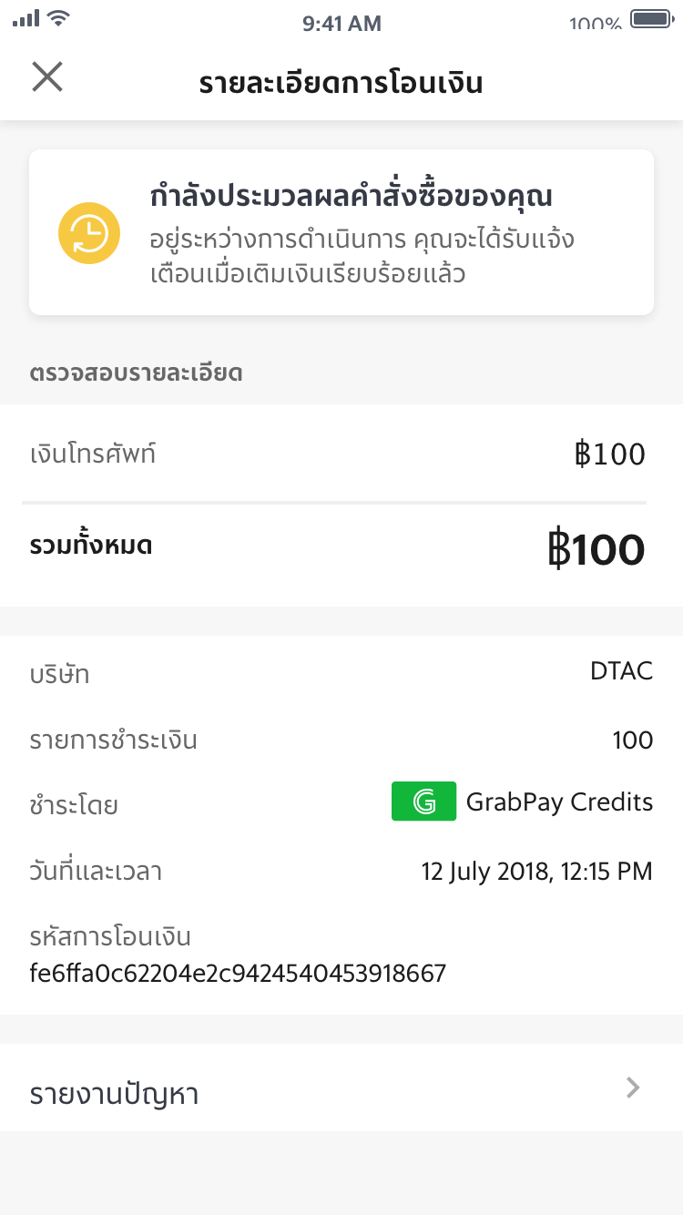
Using the findings from usability testing, I decided to create a more seamless experience, pulling the products out of a tabbed format and onto a separate screen. This helped increase load speed at the Select Mobile Credits screen and also enabled the team to add more products on the Select Top-Up Service screen. Additionally, many of the interim validation taps were removed, intending the customer to fully review and validate his/her purchase on the Review Details screen and moving him through the flow more quickly. I also updated the look and feel visually, making the font larger, higher contrast, and using more color and accent colour throughout the flow. Finally, we decided to replace the receipt screen with the same receipt styling we used for Bill Payment. We had a lot of great feedback that this receipt felt more secure.
Process:
The team ran two usability studies, one to run a benchmark study and cross check the reasons for the product analytics results and another study to test the redesign and initial sentiment to the changes the team proposed. Both studies ran in Bangkok, Thailand with 10 customers (5 GrabPay users and 5 non-GrabPay users).
Overall, the redesign tested very well and the insights from the initial benchmark study helped drive the need to pull the Top-up Service selection from a tabbed view to a list view, as well as, design the screens to be more visually accessible to all customers. These changes included higher contrast in colors used on the screens and larger font sizes throughout the flow.
Additional Features:
In addition to the redesign, I also needed to take into account the fact that the team would need to enable the ability to pay for airtime across countries and change the carriers. Thus, I created a design that accounts for these customer needs and enables obvious points in the flow for frontend to call backend for updated information like carrier services when a country code and phone number are updated.
I also added the ability for customers to add promotions. This capability integrated with Grab’s Offers service group, so I provide a linked entry point for browsing promotions and a text field for promotions that enabled customer inputs that triggered the appropriate calls.
Previous mobile prepaid design
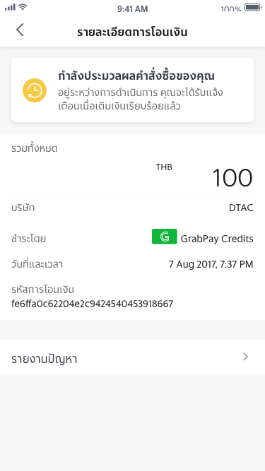
Previous receipt
Updated mobile prepaid design